Beauty in Rubble
A look at the scenic design challenges and opportunities of The Happiest Song Plays Last
by Kevin Smith, Curious Content Team
Design challenges are nothing new to The Happiest Song Plays Last Scenic Designer Markas Henry. In the last installment of The Elliot Plays, Markas had to create three worlds in one space. This time: only two countries, not worlds. But still – how do you take North Philly and the Middle Eastern country of Jordan and blend them into one perfectly unified set? There is no one better for the job than Markas, longtime Curious Artistic Company Member.
The two primary locations – a film set in Jordan and Yaz’s house in North Philly – are bolstered by secondary locations that also had to work for a scene or two throughout the play. Because of the breadth of the challenge, Markas chose to focus on the exterior textures of the two primary locations to create a backdrop for all the action.
Markas, who is also the Associate Chair and Director of Theatre at the University of Colorado Boulder, said his first thought was to make Yaz’s home more specific and lean into the North Philly neighborhood. As he researched, however, Markas realized the two places are more alike than he realized.
As he looked at common facades in both locales, he saw how north Philadelphia mirrored the war-torn areas of Jordan with dilapidated buildings covered in crumbling brick and stucco, peeling paint, and bullet holes. “The disrepair of both worlds were what we decided to feature,” Markas explained.
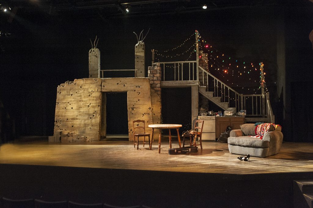
As the audience looks at the stage, to the left is a stucco structure with a doorway, at the top pillars are stripped down to rebar splaying toward the ceiling. The germination of this structure came from a research image Markas found when designing the first play in the series, Elliot, A Soldier’s Fugue. The full design team had loved the look, but it just wasn’t right for that play. The image came back up in the production meetings around the second play, and then “it finally found its home here,” Markas said.
As the audience’s eyes move right, stucco is crumbling away to reveal brick. A staircase leads down to a kitchen stuffed with pots and pans. Entering Yaz’s home from above was not Markas’s initial plan. As the design evolved, however, there was no longer a place with good sightlines on the stage floor for her front door. “We kind of realized in making choices we eliminated other choices,” Markas said. But he liked the added vertical element. “In the end, I’m happy with the solutions that we found.”
Markas grappled with whether to create a hard line on the stage separating the worlds, but found it too confining given that there would be natural spillover from movement in acting. After much trial and error, he felt it made sense to bring everything together into one cohesive space rather than create fragmented areas for each of the locations.
The perfect “cohesive blend” of those two worlds.
Yet, there is one bug in the design from Markas’s eye. The garden is not as prominent as he’d like. In changes to his original concepts, the kitchen took over what would have been the garden space. The garden ended up relocating to the far right of the stage (from the audience’s perspective); this made some seats have poor sightlines for the garden. There is a pivotal moment near the end of the play that takes place in the garden, so Markas fears “some people are not taken on a journey at the end of the play.”
Scenic design is a constant balance of what is practical and what is beautiful. Something may look great on paper, but it doesn’t give the actors enough space to move. Or the director may decide to bring forward a moment in the script, so he needs a more prominent place for that scene. “There were a lot of challenges and hair-pull-out moments. That’s part of the creative process.” After years as a designer, Markas knows it’s all about hitting dead ends, trying again, and rethinking it – which can be challenging. “Try to completely erase what you had in your head and come back with a fresh, new idea,” Markas said.
In the end, the set for The Happiest Song Plays Last is beautiful and practical. The blending of two worlds serves both the play and the actors. It takes the audience on a journey and allows for deeper understanding of this powerful work.
